Article
DAISY
FLORENTINA
FLORENCE
LINNEA
TRACK & SPOT LIGHTS
 Article – Stylish yet functional LED office lighting
 Article – Invest in people – Invest in office lighting
 DAISY article – Brilliance without the glare
Understanding the standards, but aiming higher
Books
Lighting standards and typical luminaires intended for office workplaces are generally consistent between countries. National level standards are often well aligned with the main standards, such as global “ISO 8995-1 / CIE S 008/E”, European “EN12464-1” and “ANSI/IES RP-1” for North America.
Although standards are usually not legally binding but rather recommendations, they are often referred to in laws, directives and tenders. Even when standards are not strictly followed, it seems that installations that typically use fluorescent tube luminaires have worked without too many complaints. Now with LED luminaires, there is a risk that these installations might not work the way they did before.
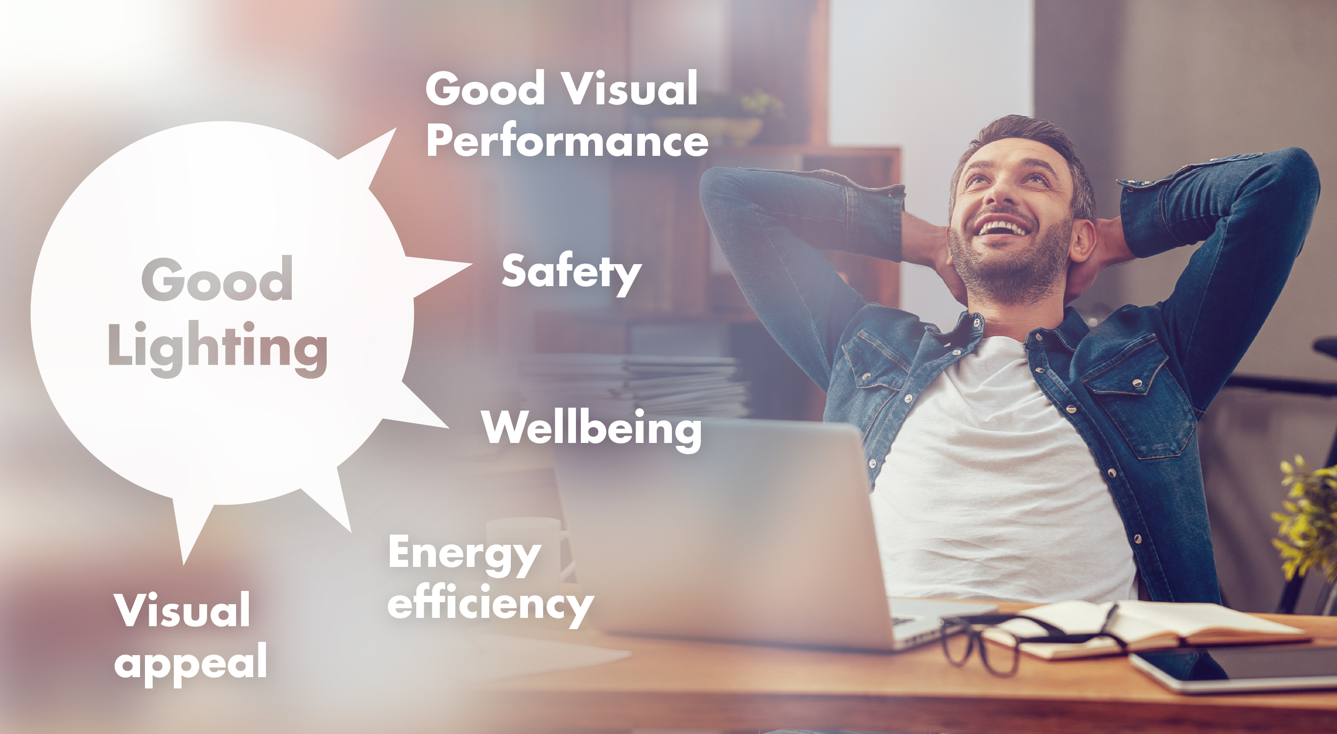
Laws relating to lighting mostly focus on ensuring luminaire and construction safety and energy efficiency rather than lighting levels. Lighting standards however set the common ground of minimal requirements for good visual performance without limiting freedom of design too much. Still, many standards publications also cover a lot of “best practices” with practical examples that help meet and exceed requirements in a more human centric way. Following the principles of these best practices can have a hugely positive impact in creating a more pleasant atmosphere and better lighting for people; but sadly, not all office projects are handled with that level of ambition.
Space
The common ideology behind all standards is to ensure task visibility by setting minimum illuminance and uniformity levels for different tasks such as glare reduction and sufficient ambient lighting. Colour rendering is typically recommended to be no less than 80. In addition, shadows, CCT and daylight integration are also covered by the recommendations but is rarely limited.
Task difficulty, length of task and in some standards such as IES RP-1, the age of the users determines the minimum lighting requirements. For younger people and less visually demanding tasks, the requirements for glare and illuminance levels are lower than for older people and more demanding tasks. It is obvious that for corridors people do not need as good lighting as for continuous reading. In public areas cylindrical illuminance should also be considered, so that people can see each other clearly.
Typical minimum illuminance levels in task areas ranges from 300 lx to 1000 lx with 500 lx being the global norm, while many studies suggest that the most preferred lighting levels for office work are from 800 lx to 1000 lx; adding more does not seem to have a positive effect, but it also depends on the ambient lighting levels that the worker is used to. If the surroundings are bright, the task area should be illuminated even brighter, as the eyes adapt to higher brightness. It is acceptable to drop lighting levels to 1/3 or 2/3 of the task area in the immediate areas surrounding it; background areas can be even lower, all the way down to 50 lx. Some contrast in the office is recommended as it makes the space more visually interesting, and the standards allow it if task areas are well illuminated.
Ambient lighting is typically controlled with illuminance levels on the walls and ceilings. The rule of thumb is to have at least a ratio of 1:3:10 between the ceiling, background (walls) and task area. If the task area has 500 lx, the walls should have an average of 150 lx and the ceiling should have at least 50 lx. The minimum luminance value for walls is commonly 30 cd/m2. When it comes to best practice and recommendations, the ceilings and walls should have much higher luminance levels than the minimum requirements in the standards. There is a lighting designer mantra “illuminate the walls, not the floor”, and in office lighting the common pitfall seems to be not illuminating enough walls and ceilings. Again, going over the top might not be ideal either, but having the same, or at least half the brightness as the task area, creates a more natural ambient light, which is psychologically better. This is especially relevant if your office is not bathed in daylight from multiple directions. The more uniform your walls and ceilings are, the more pleasant and less distracting it is likely to be, unless you are going for a planned artistic effect intentionally. Using wall washer and up-light optics will improve uniformity when luminaire placement alone fails.
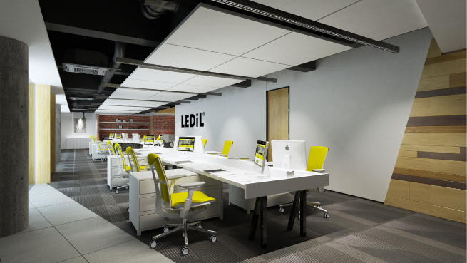
Glare – on paper and in practice
In an office context, disability glare is rarely an issue unless it is daylight related or a reflection on your screen. Discomfort glare can be hard to evaluate or even notice as its effects can be somewhat subconscious in the short term, but discomfort glare should also be avoided. Most common systems for measuring discomfort glare, such as UGR (Unified Glare Rating) and VCP (Visual Comfort Probability) are formulated based on empirical studies and try to determine the likelihood of experienced glare from all observers. A high UGR number means more observers in the same place are likely to feel direct glare from a luminaire uncomfortable.
UGR is most widely accepted globally, while in North America VCP is also used, there is a conversion table between UGR and VCP, where UGR 19 equals roughly VCP 70 %. Because of the different testing methods, the conversion might not be applicable to all luminaires and setups. In an office environment UGR below 19 is normally required for most typical tasks. A UGR below 16 is the norm for tasks requiring very high accuracy, while in corridors and public areas UGR can be higher.
How do you evaluate glare with UGR in practice? UGR is not a static number that can be linked to the luminaire. However, luminaire datasheets typically give the UGR table value in a standard room of 4H x 8H with reflectance factors of 0.7 (ceiling), 0.5 (walls), 0.2 (floor) or by maximum value from the standardized UGR table. This is a fast way to see where the luminaire could possibly be used, but only describes one grid arrangement in a standard room. The full UGR table reveals more information about the potential rooms as it considers different room sizes and reflectance and is a helpful tool for the lighting designer along with other tools like luminance curves. The most accurate method however is to make calculations using lighting design software. This method also reveals the best positions for luminaires above task areas. This is especially useful for task related scenarios without a fixed array of the same luminaire, and in cases where a lot of indirect light is used. Ideally, the lighting design and luminaire placement should be designed around the tasks so that glare is minimized. UGR, and especially the tabular UGR method, has its limitations and it might not work in every situation, but it is a valuable tool for glare evaluation nevertheless.
Conclusion
Standards are good and useful, but it is more important to understand what good office lighting is in general, and what delivers the best outcome in different scenarios.


 Article – Dark light concept
  Introduction to office lighting
  Guide – Office lighting optics
